The Brief.
As part of our User Research module, my team was tasked to identify an existing feature in need of improvement, propose changes, and test our hypotheses.
For an additional challenge, we integrated an augmented reality feature inspired by Google Maps’ AR Navigation, pursuing it as a potential enhancement to Grab’s existing pickup navigation.
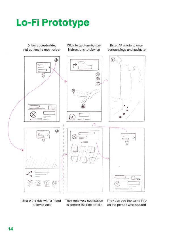
Wireframing.
Focusing on UI design and prototyping, I began with lo-fi wireframes that we tested through user surveys. Starting at this low fidelity allowed me to quickly iterate based on feedback.
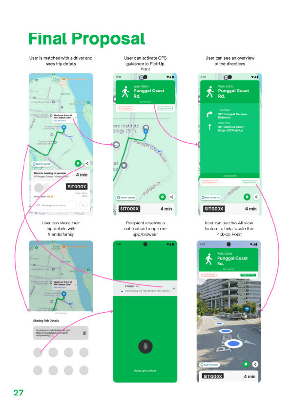
Hi-Fidelity.
Through multiple rounds of user research, we refined the design from early sketches into a smoother flow that better supported the user journey.
At this stage, I updated the prototype with UI consistent with Grab’s design language. I also proposed refinements to the preceding interface—where users view vehicle and driver details—by emphasizing real-world familiarity, such as displaying the car plate number on a realistic plate graphic
The Brief.
As part of our User Research module, my team was tasked to identify an existing feature in need of improvement, propose changes, and test our hypotheses.
For an additional challenge, we integrated an augmented reality feature inspired by Google Maps’ AR Navigation, pursuing it as a potential enhancement to Grab’s existing pickup navigation.
Wireframing.
Focusing on UI design and prototyping, I began with lo-fi wireframes that we tested through user surveys. Starting at this low fidelity allowed me to quickly iterate based on feedback.
Hi-Fidelity.
Through multiple rounds of user research, we refined the design from early sketches into a smoother flow that better supported the user journey.
At this stage, I updated the prototype with UI consistent with Grab’s design language. I also proposed refinements to the preceding interface—where users view vehicle and driver details—by emphasizing real-world familiarity, such as displaying the car plate number on a realistic plate graphic